Saturday, 23 February 2013

'For The First Time' Lyrics

"For The First Time"

She's all laid up in bed with a broken heart,
While I'm drinking jack all alone in my local bar,
And we don't know how,
How we got into this mad situation,
Only doing things out of frustration

Trying to make it work but man these times are hard,

She needs me now but I can't seem to find the time,
I've got a new job now on the unemployment line,
And we don't know how,
How we got into this mess
Is it god's test?
Someone help us 'cause we're doing our best,

Trying to make it work but man these times are hard

But we're gonna start by
Drinking old cheap bottles of wine,
Sit talking up all night,
Saying things we haven't for a while
A while, yeah
We're smiling but we're close to tears,
Even after all these years,
We just now got the feeling that we're meeting for the first time

[x3]
Oooooo

She's in line at the DOLE*
With her head held high (high)
While I just lost my job but
Didn't lose my pride

But we both know how,
How we're gonna make it work when it hurts,
When you pick yourself up,
You get kicked to the dirt,

Trying to make it work but,
Man these times are hard,

But we're gonna start by,
Drinking old cheap bottles of wine,
Sit talking up all night,

Doing things we haven't for a while,
A while yeah,
We're smiling but we're close to tears,
Even after all these years,
We just now got the feeling that we're meeting for the first time.

Ooooo
[x3]

Yeah.....
Drinking old cheap bottles of wine,
Sit talking up all night,
Saying things we haven't for a while,
We're smiling but we're close to tears,
Even after all these years,
We just now got the feeling that we're meeting, for the first time

ooooo...., yeah for the first time
(ooooo....), oh for the first time,
Yeah for the first time,
(just now got the feeling that we're meeting...
For the first time)

[x4]
Oh these times are hard,
Yeah they're making us crazy
Don't give up on me baby

Thursday, 21 February 2013

Final Draft for Magazine Advert

Final Draft - Magazine Advert

I have created my final magazine advert below. I have incorporated the best components of my previous drafts to create the final design. I have decided to follow all of the conventions, which includes the logo at the top of the page, an image of the band and tour dates and numbers on the bottom of the page. I have also incorporated the features that I felt made the sites more appealing to the audience. This includes the use of contrasting colours, to make the page stand out more. I have also incorporated the use of 'Uk Tour' to show the audience where the tour will be taking place.


Wednesday, 13 February 2013

Drafts for Magazine advert


Magazine Advert Design 1

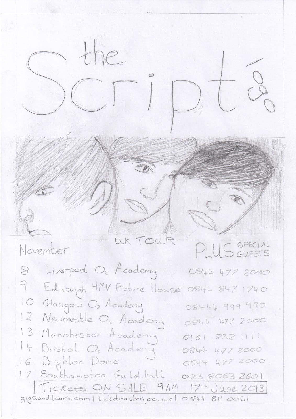
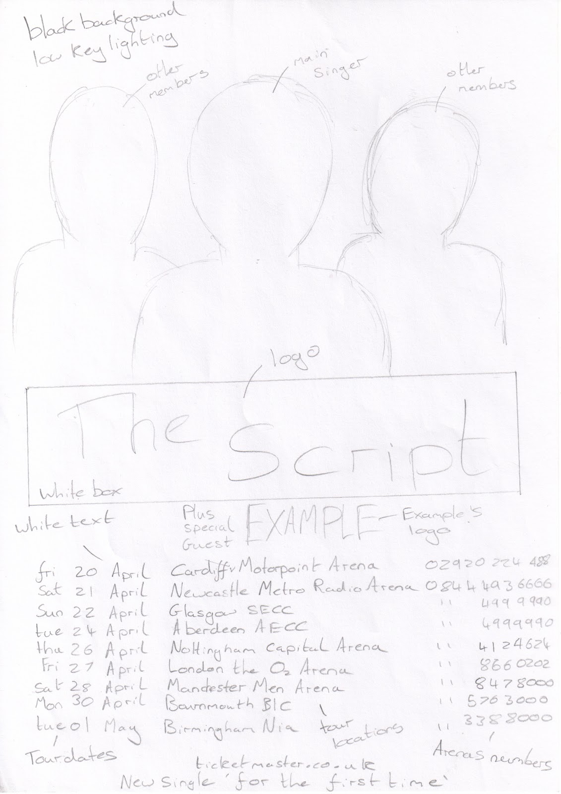
This is my first design for the magazine advert. I have used the codes and conventions discovered through the research I undertook previously. For example the 'Jessie J' and 'Example' adverts have placed the logo in the middle of the page. The 'Example' advert has placed the image of the artist on the top half of the page, just above the logo. I have followed the same design in the draft to the left. The image will have the main singer at the front of the group and the two other members behind him. This is a common layout for a band, which will further increase the connection between the magazine advert and the genre.  In the 'Green Day' and 'Example' adverts they have included a 'guest star' to the tour. I have followed this in my design in order to follow the convention and relate my product with the genre. I am using a black and white colour scheme in order to relate to the website that I will create. The colours also contrast with each other, which means that the text and images will stand out more. The date, location and time of the tour has been included, the same as the design on the 'Example' advert.


This is my second design for the magazine advert. I have used the research on existing magazine adverts in order to create adverts that follow the codes and conventions. The image of the band will be at the top of the page, similar to the 'Green Day' advert. The band members will be posing in different ways, which will make each one stand out more. The logo of the band is behind the image of the band. The reason that I designed it in this way, is because I feel it makes it look eye-catching. The audience that are fans will also be able to recognises the logo, even if only part of it can be seen. The name of the tour is just above the tour dates. The name of the tour is similar to the name of the single that we are focusing on. This advertises the tour but also the album/single. The idea for this comes from the 'Green Day' and 'Example' magazine adverts. The tour dates take up the majority of the page, which makes them the focal point of the image for the audience. At the bottom of the page, similar to 'Example's' advert, I have included the information of where to purchase the tickets and some advertisement on the album and website.I am using a black and white colour scheme in order to relate to the website that I will create. The colours also contrast with each other, which means that the text and images will stand out more.

Magazine Advert Design 3


This is the third design for the magazine advert. I have incorporated the codes and conventions learnt through the research that I undertook on existing magazine adverts. The logo of the band will span the full width of the top of the page, this will make the page stand out to the audience. It also means that if part of the poster is covered, the audience will still be able to know who the poster is for, as they can recognise part of the logo. Just below the logo is the band shot. I have used a similar style as the one used above, with each member posing differently. The difference in this image is, that the images will overlap slightly, with a slight lower opacity across the whole image. I have used a similar style to the 'Example' advert for the tour dates. This is so that the advert will look professional and be more appealing to the audience. I am using a black and white colour scheme in order to relate to the website that I will create. The colours also contrast with each other, which means that the text and images will stand out more.

Sunday, 10 February 2013

Research - Evaluation of Magazine Advert 4

Magazine Advert - Green Day


This is a magazine advert for the artist 'Green Day.' It is intended to advertise the new tour from 'Green Day' to the audience. When evaluating the magazine advert I will be looking for what features make it appealing to the audience, and what conventions are associated with a magazine advert.  I am now going to go through each feature and convention and why I feel it makes the advert more appealing to the audience:

- At the top of the page is the logo of of the band. By placing it at the top of the page, they have made the page more attractive to the audience. It also means that, if part of the magazine advert is hidden, the audience will be able to tell who the advert is about. 

- The image of the band has been placed just below the logo. They have got the three members standing close together, with the main singer standing at the front, and the other two behind him. They have used a effect that makes the image black and white, and the shadows stand out more. 

- They have followed the convention of a guest star at the tour. They have included the logo of the guest band, and the image of the bands just below the the logo. The guest bands image is smaller then the main bands image, so that it does not take the audiences attention from the main members. 

- It states that it is a 'Europe Tour.' They have used the same font as the style used by the logo. This makes the magazine advert flow and not be to overwhelming for the audience. 

- The majority of the advert is taken up by the list of tour dates and locations. They have used a similar font style to the style used by the logo. They have included the dates of the tour and next to them, are the locations of the tour.

- In the background is the same design as the one used on the CD cover. This makes the advert look attractive and appealing to the audience that are fans. It also creates a connection between the advert and CD, which will encourage the audience to purchase the CD. 

Research - Evluation of Magazine advert 3

Magazine Advert - Jessie J


This is a magazine advert for the artist 'Jessie J.' It is intended to advertise the new album from 'Jessie J' to the audience. When evaluating the magazine advert I will be looking for what features make it appealing to the audience, and what conventions are associated with a magazine advert. The above shows the two adverts  In the image above I have highlighted the features of the magazine advert that have made it attractive to the audience. I am now going to go through each feature and convention the and why I feel it makes the advert more appealing to the audience:

- The image of the artist takes up half of the page, which appeals to the audience that are fans.

- The name of the artist uses a large bold font, which has made it stand out and attract the audience. The name has taken up the majority of the middle of the page, which makes it very eye-catching.

- The name of the album is just below the logo/name. They have used the same font style as the one used for the name of the artist. This is the second largest font, after the name of the artist. 

- The designer has included a list of the albums most popular songs, which should appeal to the audience and encourage them to purchase the album.

- The colour scheme for the magazine advert is black and white. These colours contrast with each other, which makes them stand out to the audience. As the colours contrast with each other, the text and images are more eye-catching and encourage the audience to look at the magazine advert.

- At the bottom of the page is the contact information and the web address of the artists website. This encourages the audience to go to the website, which will further encourage the audience to purchase the album.

Research - Evluation of Magazine advert 2

Magazine Advert - Example


This is a magazine advert for the artist 'Example.' It is intended to advertise the new tour from 'Example' to the audience. When evaluating the magazine advert I will be looking for what features make it appealing to the audience, and what conventions are associated with a magazine advert. In the image above I have highlighted the features of the magazine advert that have made it attractive to the audience. I am now going to go through each feature and convention the and why I feel it makes the advert more appealing to the audience:

- The main colour scheme is black, white and yellow. They use red to make the new important information stand out. These colours contrast with each other, which means that the font style, images and logos stand out more. This means that the magazine advert is more appealing to the audience. 

- At the top of the page is the image of the artist. The image of the artist takes up 1/4 of the page, which makes it look attractive. The artist is looking directly at the audience, which creates a connection between the two and encourages the audience to look at the advert. 

- The artists logo is the largest font on the page, which makes it stand out. By making the logo stand out, it is more eye-catching to the audience that are fans.

- A convention I have found on some of the magazine adverts is the 'guest star.' This is were they have advertised that there is going to be a guest artist on the tour, which will attract the audience even further.

- The tour information consists of the dates, locations and the phone number of the location. This is a code and convention for the magazine adverts, and something I must include in my designs.

- At the bottom of the page is some basic contact information that gives the audience information of how to purchase the tickets. The information also advertises the artists new album and single.

Saturday, 9 February 2013

Research - Evaluation of Magazine advert 1

Magazine Advert - Plan B


This is a magazine advert for the artist 'Plan B.' It is intended to advertise the new album from 'Plan B' to the audience. When evaluating the magazine advert I will be looking for what features make it appealing to the audience, and what conventions are associated with a magazine advert. In the image above I have highlighted the features of the magazine advert that have made it attractive to the audience. I am now going to go through each feature and convention the and why I feel it makes the advert more appealing to the audience:

- The name of the artist is on the top of the page. They have used a large bold font, which has made it stand out and attract the audience. The name has taken up the majority of the top of the page, which makes it very eye-catching.

- The name of the album is just below the logo/name. They have used the same font style as the one used for the name of the artist. This is the second largest font, after the name of the artist. 

- Just below the name of the album are the ratings from the different newspapers. This makes it very appealing to the audience and encourages the audience to purchase the CD. 

- The majority of the magazine advert is taken up by the image of the artist. They have used a mid shot, slighting high angle shot. The artist is looking of into the distance, which is very eye-catching to the audience, as it makes the audience wonder what he is looking at. The artist is also in black and white, which makes it look more dramatic and the shadows stand out more.

- There is also the image of the album, to make the advert more attractive and encourage the audience to purchase the album.

- The colour scheme for the magazine advert is black, red and white. These colours contrast with each other, which makes them stand out and appeal to the audience. As the colours contrast with each other, the text and images are more eye-catching.