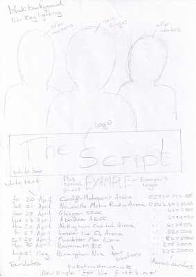
Magazine Advert Design 1

This is my second design for the magazine advert. I have used the research on existing magazine adverts in order to create adverts that follow the codes and conventions. The image of the band will be at the top of the page, similar to the 'Green Day' advert. The band members will be posing in different ways, which will make each one stand out more. The logo of the band is behind the image of the band. The reason that I designed it in this way, is because I feel it makes it look eye-catching. The audience that are fans will also be able to recognises the logo, even if only part of it can be seen. The name of the tour is just above the tour dates. The name of the tour is similar to the name of the single that we are focusing on. This advertises the tour but also the album/single. The idea for this comes from the 'Green Day' and 'Example' magazine adverts. The tour dates take up the majority of the page, which makes them the focal point of the image for the audience. At the bottom of the page, similar to 'Example's' advert, I have included the information of where to purchase the tickets and some advertisement on the album and website.I am using a black and white colour scheme in order to relate to the website that I will create. The colours also contrast with each other, which means that the text and images will stand out more.
Magazine Advert Design 3

This is the third design for the magazine advert. I have incorporated the codes and conventions learnt through the research that I undertook on existing magazine adverts. The logo of the band will span the full width of the top of the page, this will make the page stand out to the audience. It also means that if part of the poster is covered, the audience will still be able to know who the poster is for, as they can recognise part of the logo. Just below the logo is the band shot. I have used a similar style as the one used above, with each member posing differently. The difference in this image is, that the images will overlap slightly, with a slight lower opacity across the whole image. I have used a similar style to the 'Example' advert for the tour dates. This is so that the advert will look professional and be more appealing to the audience. I am using a black and white colour scheme in order to relate to the website that I will create. The colours also contrast with each other, which means that the text and images will stand out more.

No comments:
Post a Comment