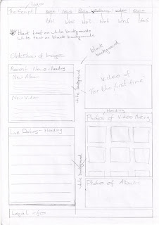
This is the first design for my website. I have used the research that I undertook when evaluating the existing websites, and used the features and codes and conventions that I found to create this design. I have put the logo at the top of the page, following the code I found on the other pages. One feature that I really liked from my research, was the use of a slideshow at the top of the page. I think that it would make my site very appealing to the audience and encourage them to stay on the site. The colour of the website is going to be black and white, the same as the colours going to be used in the video. These colours also contrast with each other, which makes them stand out. I followed the other codes and conventions of existing band website by incorporating an 'Important News' section, a 'Tour dates,' 'Legal Information' at the bottom and a 'Photo of the album.' By including these common features, it will make it obvious to the audience, that my site belongs to a band.
Design draft 2 - Website

This is my second design that I created for my website. I have used the knowledge that I had gathered from my evaluations of existing websites, and used them in order to create the website design to the left. I have used the logo at the top of the page, but altered it to create a banner. It will have a background design that will be similar to the designs used on my magazine advert. The button links are going to be unique, through the use of shapes and colours, which will make the site stand out more. I have incorporated all of the key features of the magazine. Including the 'Tour dates,' 'Important news,' 'Twitter section,' 'Legal information' and a 'Image of the newest album.' The colour of the website is going to be black and white, the same as the colours going to be used in the video. These colours also contrast with each other, which makes them stand out.
Design draft 3 - Website

This is my third and final design draft that I have created for my website. I have decided that I would use the design of the album created by one my group as the banner for my website. This will make the site look attractive and relate all of the ancillary tasks together. I have also used the logo for the band on the top of the page, which follows the convention of the sites. The colour of the website is going to be black and white, the same as the colours going to be used in the video. These colours also contrast with each other, which makes them stand out. I have used the vital components to create a band website in my design. Including the 'Tour dates,' 'Important news,' 'Twitter section,' 'Legal information' and a 'Image of the newest album.'

No comments:
Post a Comment